
Tuesday, 3 May 2016
Personal Pronouns
BUZZ WORDS


Monday, 2 May 2016
Magazine messages with the colours
The main house style colour I used throughout my magazine was the colour pink, and as well as this being conventional of magazines and being stereotyped as a 'girly' colour it has more meaning behind it. Pink is the universal colour for the love of ones self which is definitely the main message in my magazine. All the female models I used in the magazine are very pretty in their own way and have different facial features, different hair and body types. As well as the audience being influenced by these people it is also suppose to make them see that they are just as beautiful too, the colour pink used throughout really emphasizes this to my audience.
The colour blue which I also use on my front cover and slightly in the other pages connotes depth and stability, which again links into the love of ones self which the pink connotes, and also the blue is suppose to be beneficial to the human body- the models I've used are all a healthy weight and are overall healthy people which should influence the audience.
And finally the colour yellow which I also feature on my pages connotes happiness and energy which is how the magazine should leave you feeling, full of energy from inspiration and happy because they know that they are just as good as anyone in the magazine.
Double page spread article

As well as making it look appealing to my target audience I also shaped the language within the article to appeal to my audience. It is set out in a very informal tone with simple and easy language in so it's easy to read. Since my target audience's age range is around 10-17, it means they will be in school and therefore having to do a lot of reading within the education system, so outside of school they won't be wanting to do much reading. But I have written the article in the simple way that they themselves would talk, so it won't seem like a problem reading it as it's so easy to read. I've found that this is a technique used in other pop magazines as well as the type of topics/subjects covered within the article. I've talked about the artists music, childhood life including school life, something that is very relatable to my target audience. Also collaborations with other famous artists that my target audience would know/be a fan of.
Sunday, 1 May 2016


Saturday, 30 April 2016
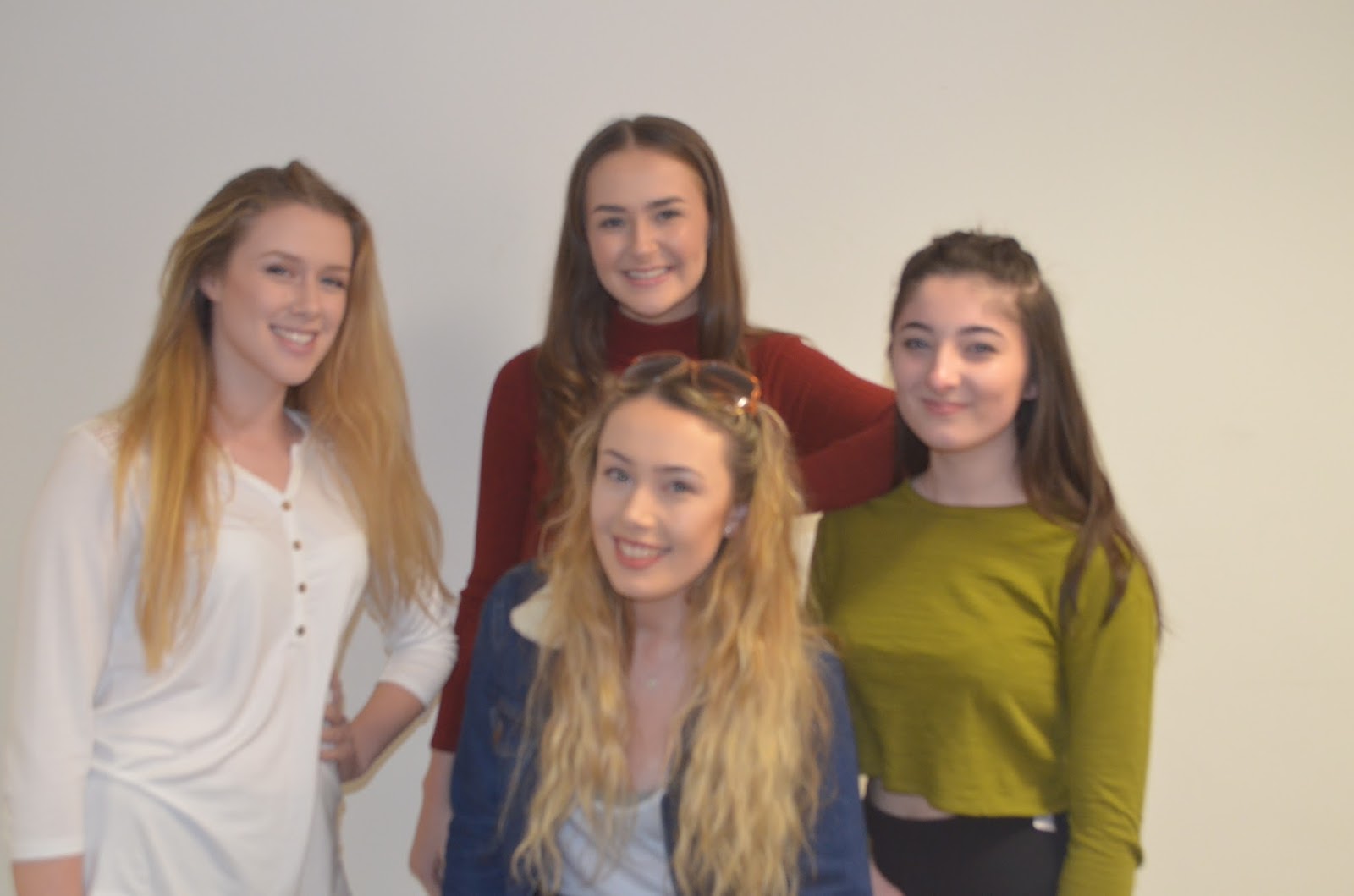
Girl group photo editing


Wednesday, 27 April 2016
Double Page Spread
 This is my rough cut double page spread and my final cut one. As you can see not a lot was changed but that it because I have really happy with the rough cut results of this page. My favourite part was definitely the positioning of my model and the hearts she was blowing. But, the problem with the photo was her costume, as it was just too casual (even though pop magazines promote casual clothing but this was too much) and it wasnt appropriate the was her belly was on show as that isn't conventional of a pop magazine. So I went a did another photoshoot with Zoe so retake the photo but in

 A few photos where the possitioning went wrong.
Another thing I changed was the fonts as the fonts in my rough cut were dreadful.The main font I used for the majority of my titles was called 'bubblebody' and I loved this font because it looks really happy, cute and makes me think of quite a bubbly atmosphere, which is what pop magazine are all about really. I also changed the font of the story to make it easier to read, and on the caption above the story you can see that the font is more bold and easier to read, and there are key words within the sentence in a different more bold font to stand out, which gives teh page more to look at and more to stand out.
Contents Page


 I featured two photos of this model Tom in the contents page, who is again on the front cover, as I found on a few examples of the contents page that a smaller photo of the same model is often featured on the contents page, and I decided to use Tom for this as I didn't have many boy model and pop magazines always do feature some boys, so I made him the main male focus of the page. I decided he should be playing football as thats a common stereotypical masculan sport which girls associate with boys, but I used the bottom photo of him looking confused with a cliff hanger caption to make the audience curious as to why he's pulling that face and will make them want to read the article on him. I had him dressed in a very simple blue tshirt as in the majority of pop magazines I've looked into the boys are just wearing simple tshirts or hoodies unless they aert the main feature, so it doesn't draw too much attention away from the main feature.
 I did feature my main model from the front page and double page spread in my contents page but only in a very small box, just to emphasise the fact that she is the main person in this edition of the magazine. I had her in different clothing though (from the first photoshoot) so it didn't all look the same and things were more different and original, also hen looking at the actual photoshoots in pop magazines the model is always changing clothing, so it is infact conventional.
 I put these two photos next to eachother on the contents page as it looks very cheesy, something every pop magazine does. The two people have no relation in any of my stories and have no interaction but the photos I have chosen make it look as if they are looking in each others direction which is visually interesting to look and could be seen by the target audeince as cute.
Tuesday, 26 April 2016


Subscribe to:
Comments (Atom)