Monday 21 March 2016

Things to remove from my magazine

I need to completely redo my contents page. I honestly just don't think it looks good at all. I need more small photos rather than one big photo, and a big problem with the photo I've got is that a part of her body and face is cut off. The colours are too dull and need brightening up, and I just don't think this layout works. I'm going to have a look back at more of the examples I analysed and see if I can take some inspiration from any different ones of them to fit my magazine better.


FONTS!!
The fonts on all three of my pages need changing urgently, I'm going straight onto dafont to find some exciting, bubbly fonts to fit in with my magazine. The fonts I have are plain, boring and don't stand out at all. This needs changing urgently!

The costume of my model needs changing as a lot of my feedback stated it wasn't conventional or appropriate, so I'm going to conduct some research to what costume is best suited for my model to fit conventions and fit in with the genre.

Wednesday 16 March 2016

Rough Cut Feedback

As you can see from my front cover rough draft my main colour scheme is pink and purple, which I think really appeals to my target audience, this is something the other students agreed on. Something else that was highly agreed on was that the quality of my main image is excellent and the layout is very conventional to a pop magazine, so these are aspects that I am going to keep. The fonts are very simple on my rough cut as I was focusing more on the layout and conventions, so I will be fixing this and finding more interesting and exciting fonts to fit with my magazine. Some of my feedback stated that the costume of my model doesn't really work with this magazine which is something I agree with, so I will be keeping the same model but need to think of something more suitable and conventional to the pop genre for her to wear. The purple section at the pop of the page labelled "quiz" needs to be made smaller as it take up too much of the page, and draws the attention away from the magazine title and the model. Another thing that was stated, which is also made clear through the contents page is that my magazine focuses more on gossip then music; I have done this as in all of my research in pop magazines this is the main focus more than music, but to fit the criteria I am aware that I need to include more about music, I think I will do this by having one of the models on the cover holding a microphone or maybe someone holding an instrument or sitting on an amp. Everyone liked the background colour of my image, as it is a mix of white and light purple/light blue which blends very well with the content on the page yet  doesn't draw away any attention.


I've found that my contents page is quite plain and not as conventional as my other two pages, it is definitely the page that needs the most work done to it. One thing I do like about it, and my audience agreed, was that I've stuck to my colour theme, and you can see a clear link between my front cover and contents page. All the sections of contents are set out conventionally like in a pop music magazine and the writers message is also very conventional. The picture is a problem as a section of her body and face have been cut off and it is very conventional. In the contents pages I have researched there are many smaller images rather than one large images, so I need to make sure this is sorted out. I also feel as though I shouldn't feature this model on the contents page as she is on my front cover and double page spread also so I should probably show pictures of other musicians who will be featured in the magazine. Again, a large problem is my fonts, they are extremely plain and don't stand out to the reader in the slightest, this is obviously down to the lack of time I had to create my rough drafts but it will be getting sorted out. Another thing I will be changing is the actual content of the magazine. It is more focused on gossip and fashion than music which is something a lot of people pointed out when giving feedback on my contents page, as well as this it was agreed among my feedback that I should get rid of the picture of the makeup and get more music related photos which is something I will be doing.


I received a lot of positive feedback in relation to my double page spread. Every one agreed that the colours work very well and really match well with the colour scheme and house style of my overall magazine. I stuck to convention by including a page number and a quote as a heading, which links in with the article itself. A lot of people really liked the hearts that I photoshopped into the page which is something I am also very fond of, it was stated that it is very good editing, is very eye-catching and links in very well with some of the content in the article. Many people liked the way the text was laid out as I stuck to the convention of having 3 columns of text, and had the questions and answers in different colours linking to the colour scheme. One problem with the article though is the middle column, as it is a different size to the other two columns and looks slightly out of place, most people liked the fact I included a screenshot from Instagram as it links well to my target audience and will be familiar to them but agreed that it needs to be tidied up a bit to fit in better with the text. Another issue with the page is the costume that my model is wearing like on the front cover. I need her to be wearing different costumes for the two but also something that fits in better with my genre, as the costume she is wearing is a bit too casual and makes the magazine look less professional. To sort this out I am going to go through my examples of pop magazines, and find the photos from the photo shoot to find appropriate clothes for her to be wearing when I re-take the photos.


Sunday 13 March 2016

I have finished the design for my double page spread on photoshop and now it just needs to be exported onto indesign to add in the article. I've put in an Instagram screenshot to go in with the article as it links in with the article I have wrote but also Instagram is a thing my target audience will be very familiar with as the current generation are known to use a lot of social media. My favourite thing so far about the double page spread is the hearts I photoshopped in. This took a while to do as I had to insert all the hearts in separately and shape them to make it look like she is blowing the kisses. The photo quality is very good and I'm happy with the result of my double page spread so far.

Friday 11 March 2016

Contents uploaded to indesign

I finished the design of my contents page on photoshop and have uploaded it to indesign to add in the text on the writers note and the actual contents. The colour purple under the writers note is something I have seen in an example I analysed therefore is conventional and I think it looks good. The colour purple is also part of my colour scheme to fits in well with my house style. I've set out the sections in the contents also like an example I analysed which you can see further down in my blog posts with the other one, I thought it works really well because it separates out all of my sections. I think I need to adjust the model a bit more as half of her body is cut of but for the time being it does the job. I also need to find some fonts to create more impact on the title.

Wednesday 9 March 2016

Rough cut so far

I've decided on the colour scheme of pink and purple, but still think there needs to be a few more colours in to make it look more appealing. There is a lot more pink and purple but that's because pink is very stereotypical of a pop magazine and is stereotypically a girly colour. I have all the modelling sorted out and have the outline for all three of my pages with a good idea of what needs to be done next.

Monday 7 March 2016

Audience Research

I managed to ask 14 people who are interested in the pop magazine genre questions to help me develop my magazine, and to make sure it was suited to my target audience. The main questions I asked were in relation to my colour scheme, the name of my magazine title, pricing of the magazine and the type of things they would be expecting to see within the magazine.


From my research I came to the conclusion that the best colours to have in a pop magazine are pink, purple, blue, red and orange, so I made a few mixtures that I thought would be best suited and asked the audience their opinion. 2 people said red and blue, 3 said pink and blue, 4 said orange and pink/purple and 5 said pink and purple, so the main colour scheme I used on my magazine is pink and purple, which is very conventional as well, these colour consist throughout my front cover, contents and double page spread

The main variation of price ranges my audience said they would be prepared to pay for the magazine varied from £2-£4. So I came up with the average of £3, but put it as £2.99, as this is marketing technique used to trick the audience into viewing the price as cheaper than it actually is, and all the magazines I have looked at us this technique which makes it conventional.


I came up with 4 different title names I could have called my magazine and asked the audience on their opinion as to which one is best. "All Pop" ranked lowest as no one chose this option, I think this is because it is very simple and not very interesting. The second lowest is "Pop Pop Pop" and again I think this is because it is quite simple and not as catchy as the other two. "Pop Sensation" received the highest amount of votes and "Pop till you drop" just received one less vote. To start of with "Pop till you drop" was my favourite title as it has a pun in it which is very catchy and sounds really good, but then I realised it sounds more like a catch phrase, and doesn't fit too well with the conventions I have seen in my research. So I stuck with the audience vote and named the magazine name "Pop Sensation". I think this is a good choice because it very clearly shows that my magazine is of the pop genre, and the word "Sensation" really draws you in, and makes you think that the magazine will contain sensational people and topics (which it would).

My audience expressed how when they read a pop magazine they are not just looking for information about the music the artists are making, it's also for information about their lives and tips to be like them. I have also found this is very conventional in the magazines I have researched as well as there is a lot of talk about fashion, love/relationships, holidays and lots more, besides information about their music. This really helped me when creating my contents page.

Tuesday 1 March 2016

Model photos

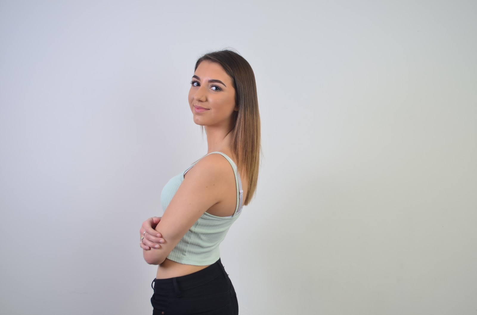
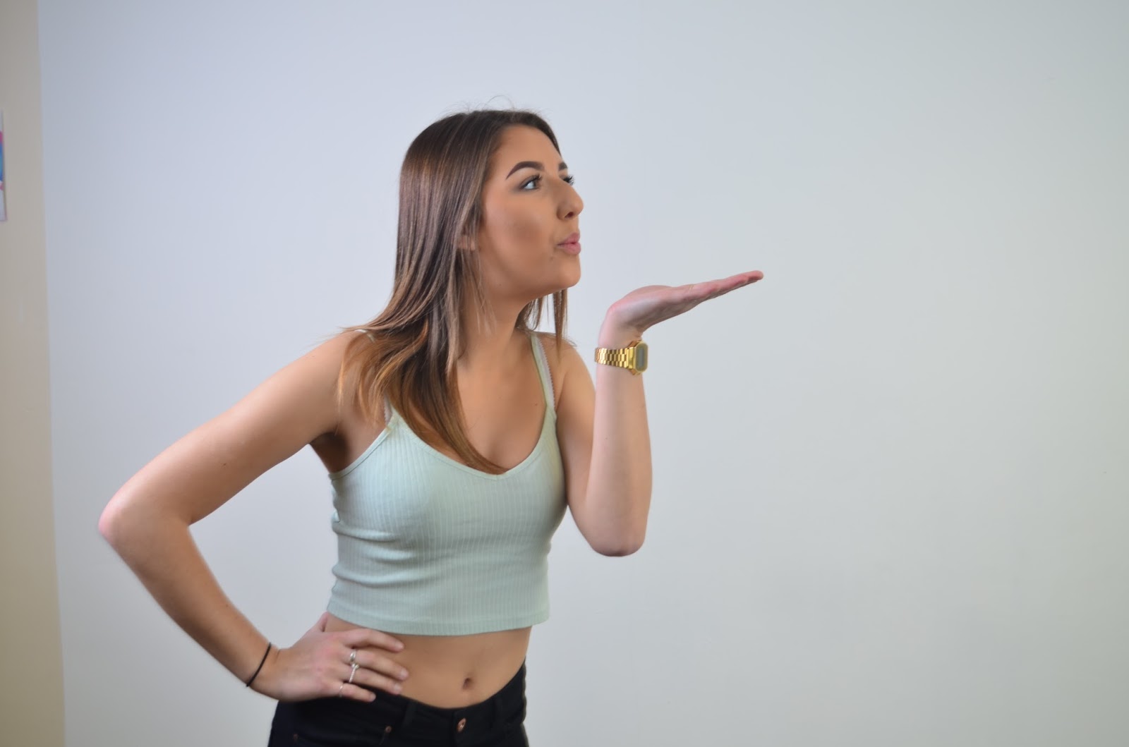
This is the model I decided to use for my front cover and main story. A recurring thing I noticed when analyzing other pop magazines was that the model is always very pretty, which good features such as hair and teeth which are all boxes which Zoe (the model) ticks. These two photos are head shots to work out what poses suit her and best and the genre of magazine I am doing. I thought that when she smiles it really emphasizes her nice teeth and she looks very pretty. Also, the the magazines I analysed the models were mostly smiling as it brings across a very positive feel and is open and friendly, which makes it a very good facial expression to put into practice. Before taking the photos we spent a long time straightening her hair and doing her makeup to make her look even more photogenic. The main makeup focuses was the contour on her face, eyebrows and mascara on her eyes, as these are all crucial features on a girls face which you notice. These are also very popular areas of the face for girls to spend time putting makeup on, which will mean my target audience will be able to relate and will be inspired by Zoe.

These three photos belong were a part of my experimentation with poses. I used a fan to create an effect with her hair like you often see models doing, but the outcome wasn't as successful as I'd hoped for. On the top image you can see the fan at the bottom of the image as the fan was very high and I wasn't able to get high enough above the fan to take the photo. Also the photos are fairly blurred and out of focus as I had to stand on my tip-toes to take the photos above the fan which meant I didn't have much balance. I liked her having her hands on her hips as showed off her figure (something else my target audience would be very inspired by) and also showed the clothes she was wearing. For my final cut of the magazine I will be taking more photos of her wearing different clothes, this was just the clothing used for my rough cut. For my final cut she will be wearing a similar top which more brightly coloured as it will go better with my house style, but will be wearing the same design of clothing as it's the type of clothes normal teenage girls wear so it will be familiar. I also experimented with different angles of photos to see which one was most effective. I personally like the middle photo where she is facing forwards as you can see all her bodily features, except from the one problem of her hair being blown up too high, which gives it too much of a messy look. Her hair looks the best of the top photo as it is being blown back but it isn't messy. I took all of my photos on a white wall with professional lighting so that the photo can go straight into my magazine with out having to edit the background, as I discovered in my preliminary when you edit the background it can often negatively affect the models.

Ariana Grande focus music video really inspired my choice of background for photos as a lot of the music video is done on quite a plain background, and you can tell that professional lighting has been used because of how flawless she looks, and brings out immaculate image quality. This is one example from the music video. It isn't a white background but it does a very similar job: