 These three photos belong were a part of my experimentation with poses. I used a fan to create an effect with her hair like you often see models doing, but the outcome wasn't as successful as I'd hoped for. On the top image you can see the fan at the bottom of the image as the fan was very high and I wasn't able to get high enough above the fan to take the photo. Also the photos are fairly blurred and out of focus as I had to stand on my tip-toes to take the photos above the fan which meant I didn't have much balance. I liked her having her hands on her hips as showed off her figure (something else my target audience would be very inspired by) and also showed the clothes she was wearing. For my final cut of the magazine I will be taking more photos of her wearing different clothes, this was just the clothing used for my rough cut. For my final cut she will be wearing a similar top which more brightly coloured as it will go better with my house style, but will be wearing the same design of clothing as it's the type of clothes normal teenage girls wear so it will be familiar. I also experimented with different angles of photos to see which one was most effective. I personally like the middle photo where she is facing forwards as you can see all her bodily features, except from the one problem of her hair being blown up too high, which gives it too much of a messy look. Her hair looks the best of the top photo as it is being blown back but it isn't messy. I took all of my photos on a white wall with professional lighting so that the photo can go straight into my magazine with out having to edit the background, as I discovered in my preliminary when you edit the background it can often negatively affect the models.
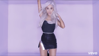
Ariana Grande focus music video really inspired my choice of background for photos as a lot of the music video is done on quite a plain background, and you can tell that professional lighting has been used because of how flawless she looks, and brings out immaculate image quality. This is one example from the music video. It isn't a white background but it does a very similar job:


No comments:
Post a Comment