Saturday 30 April 2016

Girl group photo editing


 I tried editing the photos of the girl group in different ways to make it look good on the front cover. I tried putting different colours on the background which sometimes looked ok to start with but once I but it on it didn't look very good. So I cleared the background of the image and created a blue line border behind the picture to make it look like a sort of box which I find works very well and looks effective.

Wednesday 27 April 2016

Double Page Spread

This is my rough cut double page spread and my final cut one. As you can see not a lot was changed but that it because I have really happy with the rough cut results of this page. My favourite part was definitely the positioning of my model and the hearts she was blowing. But, the problem with the photo was her costume, as it was just too casual (even though pop magazines promote casual clothing but this was too much) and it wasnt appropriate the was her belly was on show as that isn't conventional of a pop magazine. So I went a did another photoshoot with Zoe so retake the photo but in
different clothing. The main problem was getting the pose exact. It was difficult to get her body positioning and angeling right, and to get her hands and face in the correct possition. So after the second photo shoot didn't go too well I decided to print out the picture of the original photo and held it up to her to copy while I was taking the photos, which really was common sense and I should have done that in the first place but I finally got there.


A few photos where the possitioning went wrong.
 
 
Another thing I changed was the fonts as the fonts in my rough cut were dreadful.The main font I used for the majority of my titles was called 'bubblebody' and I loved this font because it looks really happy, cute and makes me think of quite a bubbly atmosphere, which is what pop magazine are all about really. I also changed the font of the story to make it easier to read, and on the caption above the story you can see that the font is more bold and easier to read, and there are key words within the sentence in a different more bold font to stand out, which gives teh page more to look at and more to stand out.

Contents Page

This is the biggest photo on my contents page, which is also the girl group that features on the bottom right hand corner of my front page. I didn't invlude my main model Zoe as the main focus of the page as that isn't conventional, it was enough her standing out on the first page. I thought the girl group would be a good focus of the page as I have seen this in other examples I have researched and also they are 4 very pretty girls which appeals to my target audience. I used a different photo to the front page as the same photo is never used within one magazine, and I decided to choose this one as the bigger one as they are all smiling and having fun, and gives a really friendly, fun feel to the audience, making them feel welcomed to read on.


I featured two photos of this model Tom in the contents page, who is again on the front cover, as I found on a few examples of the contents page that a smaller photo of the same model is often featured on the contents page, and I decided to use Tom for this as I didn't have many boy model and pop magazines always do feature some boys, so I made him the main male focus of the page. I decided he should be playing football as thats a common stereotypical masculan sport which girls associate with boys, but I used the bottom photo of him looking confused with a cliff hanger caption to make the audience curious as to why he's pulling that face and will make them want to read the article on him. I had him dressed in a very simple blue tshirt as in the majority of pop magazines I've looked into the boys are just wearing simple tshirts or hoodies unless they aert the main feature, so it doesn't draw too much attention away from the main feature.
I did feature my main model from the front page and double page spread in my contents page but only in a very small box, just to emphasise the fact that she is the main person in this edition of the magazine. I had her in different clothing though (from the first photoshoot) so it didn't all look the same and things were more different and original, also hen looking at the actual photoshoots in pop magazines the model is always changing clothing, so it is infact conventional.
I put these two photos next to eachother on the contents page as it looks very cheesy, something every pop magazine does. The two people have no relation in any of my stories and have no interaction but the photos I have chosen make it look as if they are looking in each others direction which is visually interesting to look and could be seen by the target audeince as cute.
 

Monday 25 April 2016

New photos for front cover

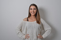
For the name photo on my front cover I changed the pose of my model, I wanted her to be happier on it as that is a lotmore conventional that the serious facial expression I had her posing for my rough cut. I also changed her body positioning to portray her as more friendly and welcoming.The costume she is wearing is just a casual jumper which I like because it is very csual and relatable to the target audience, to portray her as both a normal girl and someone who is famous.


This was the original photo, the closing was suitable or conventional,and I just think it didn't stand out enough on the front page, as she looks to calm and it's not very excitable. Below is the new photo I am using, I find that a lot of the examples I annalysed back up myreasons for using this photo as she looks happy, her wholebody positioning fills the page to make her the mainfocus as she is also the person featured on my double page spread. A thing I kept the sameabout these photos though was taking them in the studio and using the background as the background formy actual front page and double page spread. It'snot completely white and is a sort of light blue/purplecolour which is something I believe works very well and I am very fond of.


I edited the face of my model Zoe to get rid of the shinyness and to whiten her teeth and get rid of blemeshes to make her lookmore flawlessas that is what pop magazines do to their model to make them look more admirable. I also had to remove her neckless using the cloning tool on photoshop as it was very wonky which I didn't realise till after I had taken all the photos.
 Before and after photos


I originally had these 3 photos down the side of my front page, but a massive problem was that the white background made these photos look like mug photos, and the bottom two really didn't convey that thisis a pop magazine. I really liked the captions and the idea of it becuase it is fairly cheesy and very conventional of a pop maagazion. So I changed it to look like this, only keeping the top photo and getting rid of the background.
Girl groups are veyr popular in the charts and you hear a lot about them in pop magazines so I gathered a group of 4 girls pose as a girl group.the had the same white background as the previous photos did so I delted that and just made a blue border around the back of them as I had seen this in an example that I had analysed. I got a mixof blondes and brunettes as they are most commonly seen in pop magazines and decided to have them wearing quite casual clothing like my main model Zoe was so they didn't stand out among her as she is the main focus of my magazine.
 
I used this photo to create a box at the top corner of my front page as a space filler, as all pop magazine are very chaotic and contain a lot of pictures, information and writing, and I've also found when looking in the news agents that free stuff are given away with the majority of pop magazines whether it's cheep makeup or posters, so I inclused that you get a free poster inside of the magazine. Instead of just clearing the background off the photo on this magazine I used the brush tool to paint the photo blue leaving a slight white outline around the model which creates an effect as if he's shining, and is the same colour as the font I have used in this section.

Friday 22 April 2016

Final clothing

 I tried two different type of costume, the red top I wasn't very keen on as it looked a bit awkward with reflected on the poses which weren't very confident.
 I liked this pose but again not the costume so I recreated it in the second choice of clothing.

I much prefer this choice of clothing, this isn't the type of pose I am looking more but the clothing is ideal for my style of magazine.


This is my favourite choice of clothing and pose. She looks comfy and positive, it gives of a very happy attitude and she looks quite casual which will be relatable to my target audience. I think I will be using this photo as my front cover, I will just need to edit her forehead a bit on Photoshop to reduce the shine on her head.

Wednesday 20 April 2016

Photos that don't work

I find that these three photos look slightly out of place within my front cover. The background of the photos being white doesn't work as they look like mugshots. The photos of the girls don't look like photos that would be on a front cover so I am going to get rid of them, but I am going to keep the photo of the boy and remove the background because I feel like the pose and facial expression he is doing does make him look like a pop star and it is conventional for him to be wearing a hoody as that is casual and what you expect to see from males in a pop magazine but it is not conventional for the girls to be wearing that and I don't feel like they fit in with the genre.


At first I really liked the Instagram screenshot within my double page spread as it is something my target audience will be able to relate to and it is conventional of pop magazines to have a photo within the article. But having this photo in made my columns uneven with different width lengths, I tried it in many different places but it always caused the same problem, the only solution to it was to stretch the image but that makes the image distorted and doesn't look good at all, so I just deleted the photo so that the article columns were all aligned with the width of 62mm, and it looks a lot better.


Friday 15 April 2016

Fonts

 I spent quite a long time on the 'dafont' website looking for suitable fonts to fit my magazine as on my rough cut the fonts were terrible and boring, they needed massive improvements. These are the two fonts that I liked the most. I think the bubbleboddy one will be good for titles and heading, and the same of my magazine- most likely the things that need to be big and bold and it looks quite cute but stands out at the same time. The DK Surgary Pancake will be used for smaller writing, maybe little sub-headings in the contents page or under pictures, maybe even as the font in the article in my double page spread.